
Driver App
KIRFU is a UK logistics marketplace giving independent drivers flexibility across multiple delivery providers. As the founding product designer, I built the driver experience from scratch - shift discovery, live navigation, voice assistance, and proof of delivery for people who are driving, under time pressure, every single second they're using the app.
Overview
Founding Product Designer
2 years
CEO, CTO, Engineering, Marketing.
Product Strategy • UX Research • Interaction Design • Prototyping
Research planning, information architecture, user flows, wireframing, interaction/UI design, prototyping, usability testing, developer handoff, and design QA.
The MVP was built, tested with 8 delivery drivers in realistic scenarios, and validated before the project concluded. Some visuals have been recreated to respect confidentiality. All design decisions and outcomes reflect my actual work.
Some visuals have been recreated to respect confidentiality agreements. The design decisions and outcomes reflect my actual work.
Product Overview
KIRFU is a UK-based logistics marketplace designed to give independent drivers more flexibility in how they find and complete delivery work.
Unlike traditional delivery platforms tied to a single logistics provider, KIRFU aimed to let drivers discover and accept shifts across multiple providers through one app.
I worked on the Driver App, the primary experience for discovering shifts, navigating deliveries, accessing assistance, and completing proof of delivery.

While Kirfu includes multiple products, this case study focuses on the Driver App, the primary touchpoint for gig drivers managing shifts and completing deliveries.
Understanding the Problem
Delivery drivers operate in one of the most cognitively demanding environments imaginable, moving vehicle, time pressure, parcels, traffic, deadlines, and a phone screen all competing for attention at once. Before I touched Figma, I needed to understand what that actually felt like.
Through user interviews, ride-alongs, and workflow mapping, I identified recurring challenges that affected efficiency, safety, and the overall delivery experience.
Key Pain Points
High Cognitive Load
Drivers had to manage navigation, parcels, traffic, delivery deadlines, and app interactions simultaneously.
Limited Flexibility
Drivers wanted more control over when and where they worked rather than being tied to a single provider.
Operational-First Interfaces
Existing delivery tools often prioritised operational requirements over the driver’s experience in the moment.

Driver Journey and Pain Points
Design Opportunities
Simplify Shift Discovery
Help drivers quickly understand and compare available opportunities.
Reduce Cognitive Load
Surface only the information needed during active deliveries.
Design for Context
Support drivers at critical moments without requiring unnecessary interaction with the screen.
Understanding the delivery journey helped identify where thoughtful interaction design could reduce friction and support drivers in real-world conditions.
Research & Discovery
Research Methods
10 Driver Interviews
Understand work patterns, expectations, and frustrations.
Ride-along Observations
Observed drivers completing deliveries in real-world conditions.
8 Drivers involved in MVP testing
Validated early concepts with 8 drivers and refined key interactions before development.
Summary
Navigation carried the highest cognitive load
Drivers were simultaneously managing routes, traffic, deliveries, and time pressure, making navigation one of the most demanding parts of the experience.
Flexibility mattered alongside efficiency
Drivers wanted control over the shifts they accepted, including when and where they worked.
Drivers expected a modern digital experience
Drivers were accustomed to polished consumer apps and expected the delivery experience to feel clear, intuitive, and visually considered.
These findings shifted the focus from simply adding functionality to designing an experience that supported drivers at the moments that mattered most.
Design Principles
Four principles came out of the research that I kept returning to every time I had to make a hard design call:
Reduce Cognitive Load
Show only the information needed for the current task.
Progressive Disclosure
Reveal complexity gradually instead of presenting everything at once.
Design for Speed
Help drivers understand and act quickly through clear hierarchy and concise interactions.
Context Over Complexity
Surface the right information at the right moment rather than exposing every feature simultaneously.
These principles became the foundation for every product decision—from how drivers discovered shifts to how they navigated deliveries with minimal distraction.
#1: Simplifying Shift Discovery
The Challenge
Drivers needed to compare shifts based on time, location, company, earnings, and duration. Presenting all available information at once made comparison slower and increased cognitive effort.
My Design Decision
I introduced a card-based shift structure that prioritised the information drivers needed to make an initial decision.
Each card highlighted:
Shift date & time
Company name
Earnings
Shift duration
Progressive disclosure
Secondary information such as warehouse location and parcel count was moved into the next level of the experience, keeping the initial decision lightweight.
Why It Matters
The goal wasn’t to remove information. It was to sequence information according to the decision drivers were making.

By surfacing only the information needed for the initial decision, the experience became faster, clearer, and easier to navigate. In testing, 6 of 8 drivers completed the shift-to-delivery workflow independently, this card structure was the first thing they cited as feeling intuitive.
#2: Designing the Delivery Experience

The Challenge
The interface needed to surface critical information without overwhelming drivers who were already managing navigation, parcels, traffic, and delivery deadlines.
My Design Decision
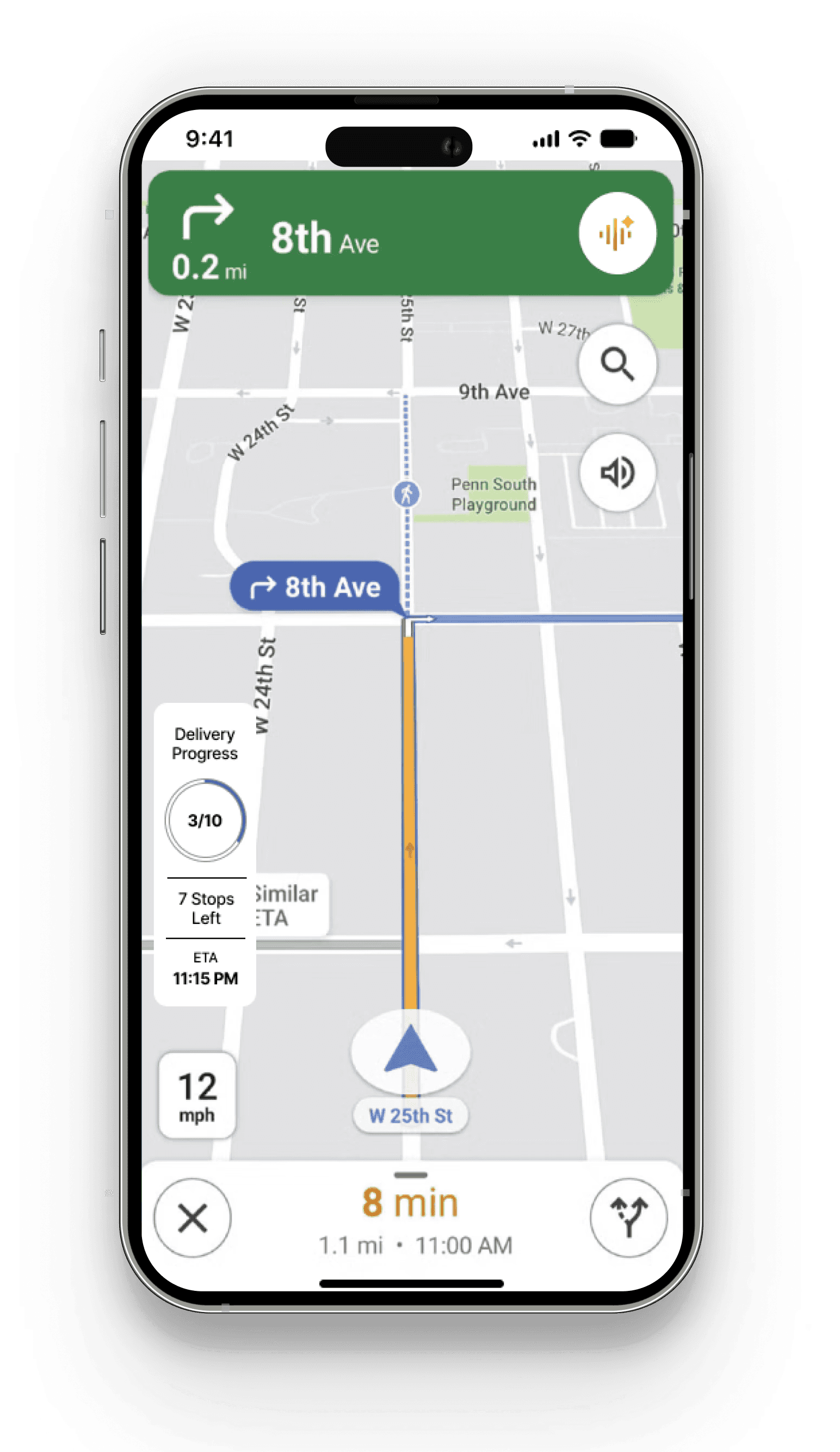
I designed the active delivery experience around a clear information hierarchy, prioritising:
The interface prioritised:
Turn-by-turn navigation
Next delivery destination
Current speed
Delivery progress
Quick access to proof of delivery
Supporting information was progressively revealed only when relevant.
Why It Matters
Rather than adding more features to the screen, I focused on reducing distractions by presenting information only when drivers needed it.
Good navigation design isn’t about displaying more information, it’s about displaying the right information at the right moment.
#3: Designing Contextual Voice Assistance

The Challenge
During deliveries, drivers needed timely information without taking their attention away from the road. Constantly interacting with a screen increased distraction and cognitive load.
My Design Decision
Rather than making NEMO available throughout the entire app, I designed its interaction around the navigation experience for the MVP.
NEMO was partially implemented in the MVP, with some voice interactions simulated during testing. Drivers were able to test the concept in the delivery scenario.
NEMO was designed to provide contextual support such as:
Live traffic updates
Weather alerts
Route guidance
Delivery-related assistance
Why It Matters
Limiting the assistant to a high-value context allowed the team to explore voice assistance without expanding the MVP unnecessarily.
The temptation with AI features is to make them do everything. The harder, better decision is knowing exactly where it earns its place and designing it to disappear everywhere else.
Bringing the Experience Together
Each feature was designed to solve a specific problem while contributing to a cohesive end-to-end product experience.

Accept Shift

Navigate
NEMO AI

Proof of Delivery

Complete Shift
Features
Flexible Shift Discovery
Browse and compare shifts across multiple logistics companies with clear, structured information.
Navigation-First Experience
A streamlined interface designed to minimise distractions during active deliveries.
Contextual AI Assistance
Voice-first support delivered only when drivers needed it most.
Seamless Proof of Delivery
Capture delivery confirmation with minimal interruption before moving to the next stop.
The result was a product that balanced operational efficiency with a driver-first experience, helping users stay focused on the road while completing deliveries with confidence.
Validating the Experience
I evaluated the working MVP with 8 delivery drivers using realistic delivery scenarios. The sessions helped identify friction in onboarding, validate key delivery workflows, and understand where voice assistance could provide value.

Results
6/8
Drivers completed the key shift-to-delivery workflow independently.
5/8
Drivers preferred voice assistance during the navigation experience.
2/8
Drivers experienced friction during onboarding.
Key Learnings
✔ Navigation required the clearest information hierarchy.
✔ Drivers responded positively to a modern, visually polished interface.
✔ Voice assistance was most valuable when drivers were already focused on navigation.
✔ Onboarding needed further refinement before wider use.
Testing reinforced that reducing cognitive load isn’t about removing functionality, it’s about presenting the right information at the right time.
What I'd do differently
Looking back, the onboarding friction (2 of 8 drivers struggled) was something I identified late. I'd push for earlier, lower-fidelity onboarding tests even paper prototypes before committing to the full flow in development. I also underinvested in the design system documentation early on. It existed, but wasn't as handoff-ready as it should have been, which created back-and-forth with engineering that cost time. If I were starting again, I'd treat the design system as a first-class deliverable from week one, not a polish task at the end.